
Sunday, May 31, 2009
Saturday, May 30, 2009


The center picture was not designed by myself: It is the inspiration for the two Magazine covers that I made for the Architecture magazine METROPOLIS. I think these turned out really true to the graphic design style of the company. They're really free with their typography so it was really fun to play around with how things should work. If you didn't notice I've included a few jokes in there too. Ha! I might actually design a full years worth of these they're pretty easy once you get a understanding of the direction in which you want to go.
I might just apply for an internship with them as their Intern graphic designer :-)


After a few hours reading various advertisements for Herman Miller furniture (I'm developing a unhealthy relationship with it... its so... beautiful. I can't help myself) I've decided to follow up with a ad campaign for IKEA. I love IKEA, but I feel like they do some great advertising. And some really annoying advertising.
Point: most of their advertising focuses on the price of the object, rather than the design.
I found this vintage ad for Herman Miller chairs and was so blown away by the simplicity of the design. I have such a respect for the International Typographic Style (ITS) I feel like the simplicity of the type as well as the dynamism of the photo are awesome! Who would have thought that just lining chairs up with each other could be so effective graphically [purrs to self].
So: I created an IKEA ad following the format and layout of the type presented by the poster in hopes of recreating some of the qualities of it. I'm not sure if it works with IKEA, I still think that the price (14.99) NEEDS to be a part of it, but I like how Herman Miller excludes the price, and really just lets the customer appreciate the design rather than the weight of their wallet. True masters. True masters indeed.


Another redesign, I was just thinking how 80's they typeface century gothic feels. it's always eluded me how iso 50's work looks so "retro" there's something to using a typeface in a way that really makes it feel of a generation.
Anyway. I just reorganized the type around to make it feel more like a poster than a picture.
Friday, May 29, 2009


again following the same idea as the last post:
After watching enough arrested development to seriously kill a person in the past few days, i've recreated the poster that was originally used for the show. I tried to follow the basic rules that the poster sets up, but in this case I threw out a lot of what was there. I added my favorite quote from season one- the banana stand. Oooh the banana stand. The greatest and most successful business endeavor of the Blooth family. I'm still trying to figure out where the designer got the whole bathtub idea... because it never happens in the show, but I admit. It apparently makes for a good photo shoot.
Oh: I forgot to add: Arrested Development uses the typeface: Arial Black, if you look carefully I messed up on the RR those were stumping me. so I gave up after a while.
Thursday, May 28, 2009


I thought I would do a different spin on the graphic design of this series. I was suprized at how long it took me to figure out the different type faces that are used in the "WEEDS" of the title. The capital letters were Times New Roman. (easy right) and Didot for the lower case "e" I realized that this wasn't exactly right, but I liked how Didot has a lot lighter use of line, so I went with that just for aesthetics. I wanted to use imagery that didn't evoke the qualities of the "drug" culture that surrounds the show, I think that the use of the leafs and plant starts to get kitschy and frankly I find more subtle implication of "weeds" more suitable. Because the character obviously doesn't wear the drug on her sleeve. Anyway: my take.
Wednesday, May 27, 2009
Tuesday, May 26, 2009

this is just a rendering that I did using C4D. It actually didn't take too long to render less than 10.00 min for the computer to calculate. It's actually a modification of a sample scene that demonstrates the GI settings of the new release of C4D. I deleted the model and built my own using array settings and shiny plastic materials.
Monday, May 25, 2009

Sunday, May 24, 2009

I've seen quite a few of these on flickr, except I think they're actually done by people who don't use 3d Rendering programs. I made this in a few min doing a quick rendering via c4d and then using a multiply/overlay layer in photoshop. Easy peasy.
it reads: Type in Space
And yes. it appears much more epic than it should.
Saturday, May 23, 2009
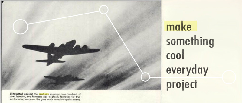
 this one actually is a great story: over on the original "Make something cool everyday" group at fliker one of the members posted a comment about cliché design crap: like skulls, bears, deer, and people from the 30's. All of which I like. Feeling guilty and caught red handed: I responded with this following her formula for awesome graphic design. Yeah. it's a Koala... and yeah. Kolalas are awesome. Who knew?

Friday, May 22, 2009


I just thought I would post the original image because I really liked my version of this image, but I feel like they are so close that to see the changes and the differences. I donno. theft? maybe- maybe not. I can't decide on this one.
The image comes from "the girlfriend experience". I really love the graphic design of the movie's poster so I couldn't help myself to a film still taken from the movie and play around with the photography.
Thursday, May 21, 2009

Wednesday, May 20, 2009

Tuesday, May 19, 2009

I made this image before I actually saw the movie "Space Odyssey 2001" I was mostly reading about it's history and was very startled at just how much this film has acted as the precedent for seemingly EVERY science fiction movie that I have seen in my life.
The rainbow burst coming from Dave is actually a picture of a star via Hubble Telescope.
Monday, May 18, 2009

Sunday, May 17, 2009

Saturday, May 16, 2009

Friday, May 15, 2009


[Dog] This is likely one of my favorite images i have created to date. It was a very simple construction, just copying and pasting the image over itself to reinforce a kinda rhythmic graphic quality. I chose the color light blue because my grandma had mentioned that that color was one of her favorites for dishes in the 1950's and I thought that was kinda cool.
[inspired by] I have come back to add this image a few times. This is a still from a commercial from the Troika Design Group. An amazing firm, that I swear... has designed everything that I own or like. Their work totally blew me away and has really made me look back at how I think about images and refine my thinking.
Thursday, May 14, 2009

Wednesday, May 13, 2009

Tuesday, May 12, 2009

Monday, May 11, 2009

Sunday, May 10, 2009


Saturday, May 9, 2009

Subscribe to:
Posts (Atom)